
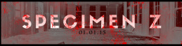
This is our final banner for our website. The banner was made on Adobe Photoshop. The size of the photo was fitted perfectly on every page at a measurement of 959 x 224px. The font of the title on the banner was made to be bold and eye catching. The banner matched the genre of our sequence with added blood stains. I added text contrast with the background. I added Inverted colour filters were added onto the background. The original background behind the text started off as a normal abandoned hospital. I changed the colour of the background by switching the colour of it on the colour scale to opposite. What this resulted in was dark effects which gave the outside of the windows dark surroundings. Blood fragments were added deliberately onto the text itself to give the title a gorier look to it. The title was still readable and was in the genre of the film. The main aim when making this title was to make it look professional.

This is a draft title for our film. I used a basic bold font (Bell Gothic Std Black). The fact that I made it bold meant that it would stand out. I changed the colour of the letter 'Z' to red. The letter 'Z' stands for zombie, the colour associated with zombie films is the colour red as it represents Death, blood. Also associated with the letter 'Z' being red is it suggests that the movie is going to be gory. I also added a blood image below the letter 'Z' to get the full blood effect across. This also would give the audience a clue that the film will involve death.
(KD)
(KD)
Examples of Horror fonts used in popular films:
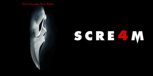
Font choice is a key aspect to the opening title sequence, as it will enhance how the title comes across to the viewer. For Scream (1996) a slasher horror film uses a basic font but on the "M" the middle is lowered which shows a sharp tip, this then links to the movie itself as the killer in Scream uses a knife to kill it's victims. The use of white writing on a black background is effective as it draws attention to the text and causes the audience to focus on it. The colour red has connotations of blood and death, therefore the use of a red character in this title suggests the film is a gory horror as red is the conventional horror colour. (AD) and (MG)
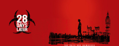
Another representation of font linking to the movie is the title for 28 Days Later (2002). A basic bold font is used for the title and behind it is what seems to be a toxic chemical symbol, typical to most zombie horrors the movie is based on chemical testing on animals that has broken out to the public. The layout of the title suggests the basic plot of the movie which is a key part in order to catch the attention of potential viewers. The usage of red as the base colour suggests that the flim is going to be gory but also suggests that the infection is in the blood. The white text draws the attention and causes the audience to focus on it, as the title is bold in white it draws attention to "The Days Are Numbered" as it is also white which causes the reader to assume it is of some importance.
(A,D)
(A,D)
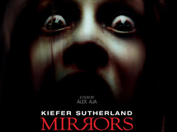
The title used in this film is a basic font which is wrote out in capital letters. The title is red, the colour red has connotations of death, blood. This also gives the audience a clue to what genre the film is. Due to the dark background it make the title stand out even more which suggests that its the main focus of the poster. Also in between the letter 'R|R' is a mirror line between the two letters, this has relevance to the word mirrors but also makes the poster stand out.
(KD)
(KD)
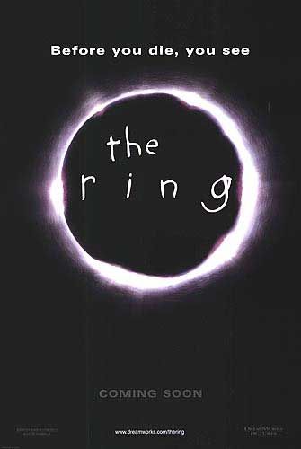
The font used on the poster seems very child like so suggests that a child plays a strong role in the events that occur throughout the movie. With the text being inside a ring it draws the attention to the title making it the centre of attention, with the text also being white on a black background it attracts the audience to it which will indicate the relevance of the title as it is centred in a ring, which also is drawn very roughly which links towards the role of a child to be important in the movie. As well as the title there is a quote saying "Before you die, you see" this text however isn't written in a child like manner which suggests its importance outside of the initial thought given, it can induce a range of speculations to what may unfold throughout the movie.
(A.D)
(A.D)
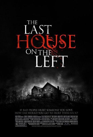
The title for The Last House On The Left (2009) uses conventional horror colours white and red, these also are used to stand out on the black background to draw attention to the title. The title and font choice gives us clues about the film by the use of colours. Having only the word 'house' red with splatters of blood suggests that the house is going to play a large role in the film as it stands out from the rest of the cover which is monochrome. Also as the colour red itself has connotations of blood, gore or death which suggests what might occur in the house. The use of blood splatters suggests the film will be a very gory film, possibly a slasher and we get the immediate impression that death will be a frequent theme throughout.
(M.G)
(M.G)
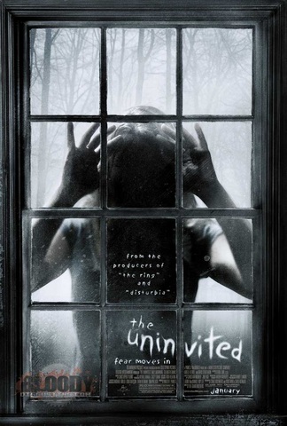
The Uninvited (2009) title suggests that the film is a paranormal, this is because the whole cover is in black and white monochrome. The writing is coloured white to stand out among the cover and also to look cold and ghostly. The font used also looks very chilling and. The font used for 'the uninvited' also looks very child like which suggests that a child may play a large part in the film.
(M.G)
(M.G)
